Perhaps, as would seem appropriate for such a post, I should illustrate my point. Which of these looks "right"?
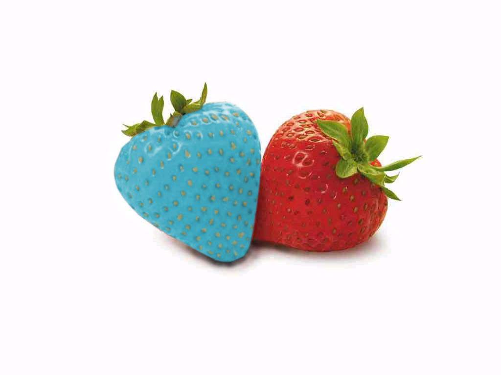
Unless you're deliberately perverse, or a keen sensation seeker (in which case, beware the blandishments of Slaanesh!), you'll have picked the red one. Which is the one on the right for those of you who are colourblind or are watching in black and white. I guess my point is that we are so used to particular colours being associated with certain plants, fruits, creatures, natural phenomena etc. that any radical departure from that, even when the form is retained, seems freakish or dangerous. Witness the cruelty that has been inflicted on albinos over time.
Sticking with toy soldiers, rather than social commentary, colour can be used to similar effect. Ordinary creatures can be given a sense of the monstrous by painting them in an unexpected colour. Even monsters can be made more... monstrous? unnerving? ... by varying their expected skin or fur tones. Dale Hurst did this in his classic Tzeentch warband with the minotaur. Even without the wings, painting it with zebra stripes is sufficiently outwith the expected to catch the eye.
 |
| I think I originally downloaded this from Orlygg's blog |
So, why this post today? Mainly because I thought I'd give it a go, but the idea of skin tones was already fairly close to uppermost in my (geeking) mind from playing with different shades for the goblin archers I showed earlier this week and their comrades who I'll share soon. Like Dale, of all the chaos themes in the Warhammer world, I'm most drawn to Tzeentch so I've combined all the blether from above to paint up my first two chaos hounds. In lurid colours, naturally!
 |
| The bad dogs of the post title... |
 |
| ... these two would rather eat you than play fetch |
These are hyenas from the £1 cabinet at Foundry that I picked up at BOYL last year (won't be going this year as it clashes with my wedding anniversary, drat!). Fur drybrushed in shades of grey, skin painted in Foundry triads - Bright Blue and Nipple Pink respectively, then washed all over with GW washes (Asurmen Blue and Leviathan Purple). For a first attempt I'm content with them, particularly the purple one which I did second, and it's given me ideas for future hounds and experiments with unusual colours. They also take me up to nine miniatures painted this holiday!
Put some psychedelia into your painting!
Rab
Lovely hounds there!
ReplyDeleteThank you!
DeleteNice and colorful work. As you say, changing up expected colors can have a effect on figure perception, although doing it "realistically" is challenging!
ReplyDeleteAs someone with mild colorblindness myself, I have often been interested in what the world would look like to someone more severely impacted.
Yes, the "realistic but a different colour" was what I was trying for and I think these two are a good first step :)
DeleteVery cool looking figures; BTW, the blue strawberry grows on you after a while.
ReplyDeleteThank you, Dean, but I wouldn't mention that blue strawberry in public - you'll have the Inquisition after you!
DeleteExcellent pair of hounds.
ReplyDeleteWhen I see strangely coloured Strawberries, I think immediately of the Lightning Seeds album "Jollification".
Thank you - and I'd forgotten about "Jollification", but it would explain why the strawberries were reminding me of something!
DeleteExcellent idea and article on colour perceptions.
ReplyDeleteGreat painting of the hyena/hounds, I might borrow that idea when I get around to expanding my Dark Elf army. Love the bases as well. :)
Thanks, Lee :) Be my guest! I'd love to see what you come up with.
DeleteQuite an original palette on your K9's, fitting for the hounds of chaos. They must've been great fun to paint, will there be an entire rainbow in the unit?
ReplyDeleteNot quite! I'll stick to the usual Tzeentchian palette of blue/purple/yellow/turquoise, although now you've planted the seed and a unit of seven does have a certain appeal....
DeleteThese look great. I especially like the purple one, nice and sinister, although I also think it's helped by being the better executed of the two by whoever sculpted them.
ReplyDeleteAlso it's a good thought to go with hyena models for this, definitely an idea I'll be stealing!
Thanks, Paul, the shape of the head of the purple one really emphasise the eyes nicely. A quick dot of bright green, and voila! instant hound of the Baskervilles trope fulfilment :)
DeleteI had thought about this idea for chaos thugs or humans that still look normal, except for weird skin and hair coloration. The problem is I've been too wishy washy to actually do it. Do I tint flesh paints, just use the colors straight? Just my usual over thinking.
ReplyDeleteI used the colours straight, but tried to apply them as if they were flesh tones with the same highlighting and so on. For human (well, nearly human!) weird skin I think I'd take the colour I wanted and add increasing amounts of a pale flesh colour to highlight. Just go for it! Worst that can happen is you have to dunk it and start again :)
Delete